VitaePro
Uniting one of Scandinavia's best-known supplement brands across five markets, in digital, TV and print.
- Client
- VitaePro (NutraQ, part of Orkla)
- Role
- Head of Design, Sweden
- Year
- 2021-2025
- Services
- Art Direction
- Campaign Systems
- Performance Creative
- Photo Compositing
- TV Commercials
- Multi-Market Rollout
OutcomeSales grew every year of my tenure, with five markets held to one brand style and a new launch in the Czech Republic.
01Challenge
Five countries, five opinions, one brand.
VitaePro is one of Scandinavia’s best-known supplement brands and the biggest in NutraQ’s portfolio, sold by subscription. Orkla acquired NutraQ in 2021, and that same year I joined as Head of Design Sweden, working in a team that designed for digital, TV and print. I also ran much of the Danish market, supported the other countries and was part of the team that launched VitaePro in the Czech Republic.
When I started, VitaePro didn’t feel like one brand. Every market did its own thing, with its own look and tone, so it read like a different company from one country to the next.
From 2021 that was our mission: one visual identity that holds all five countries to the same style, tone and standard, so the work looks consistent and still feels local wherever it runs.
In numbers
- 5Markets: Norway, Sweden, Denmark, Finland, the Netherlands
- +1New market launched: the Czech Republic
- 3+Years as Head of Design
02Performance
One master visual, built to perform.
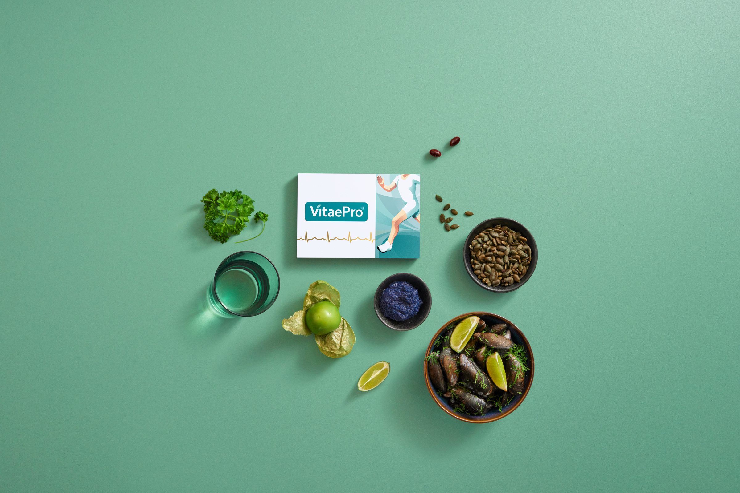
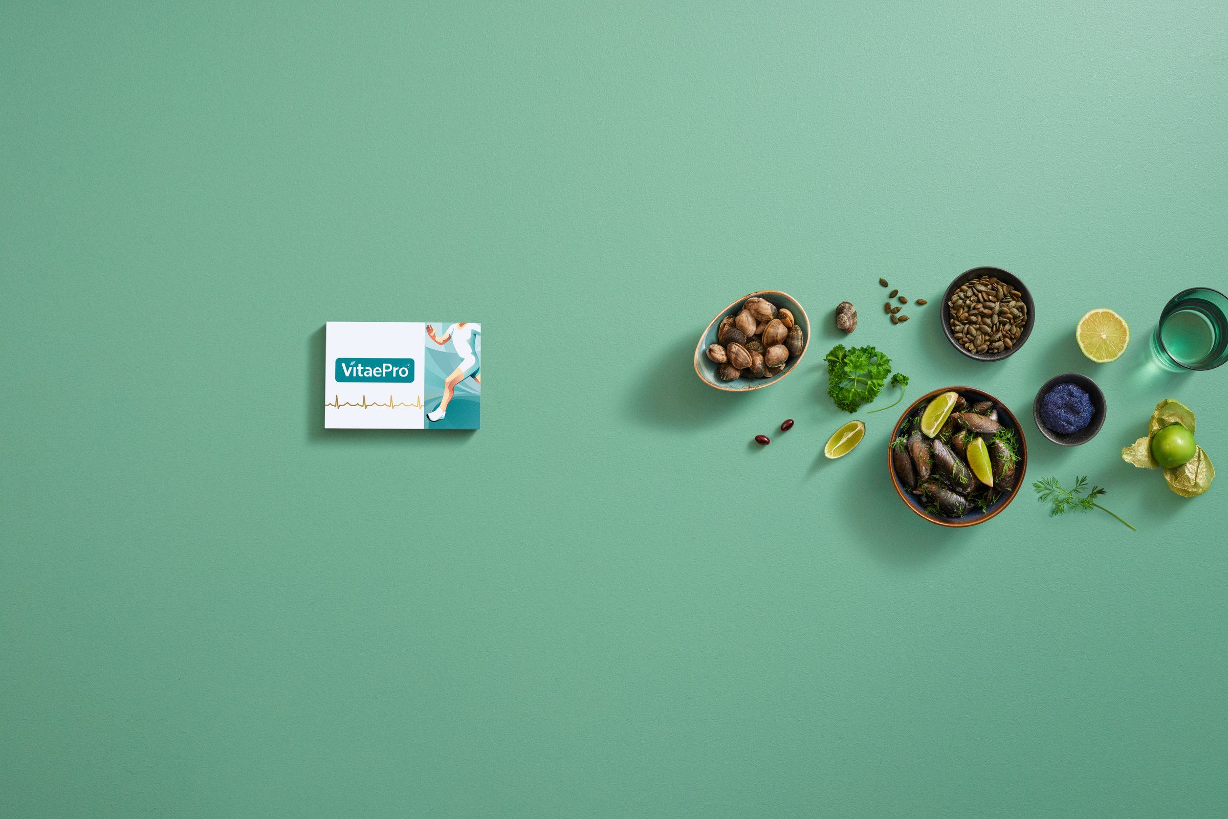
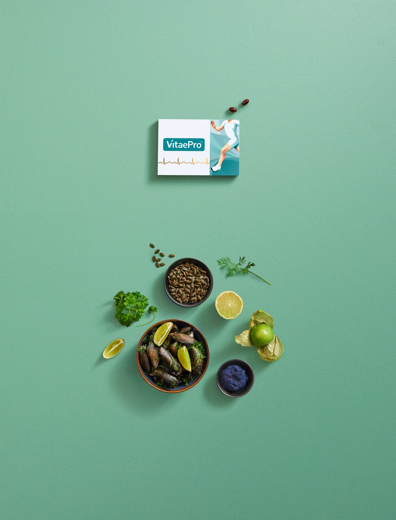
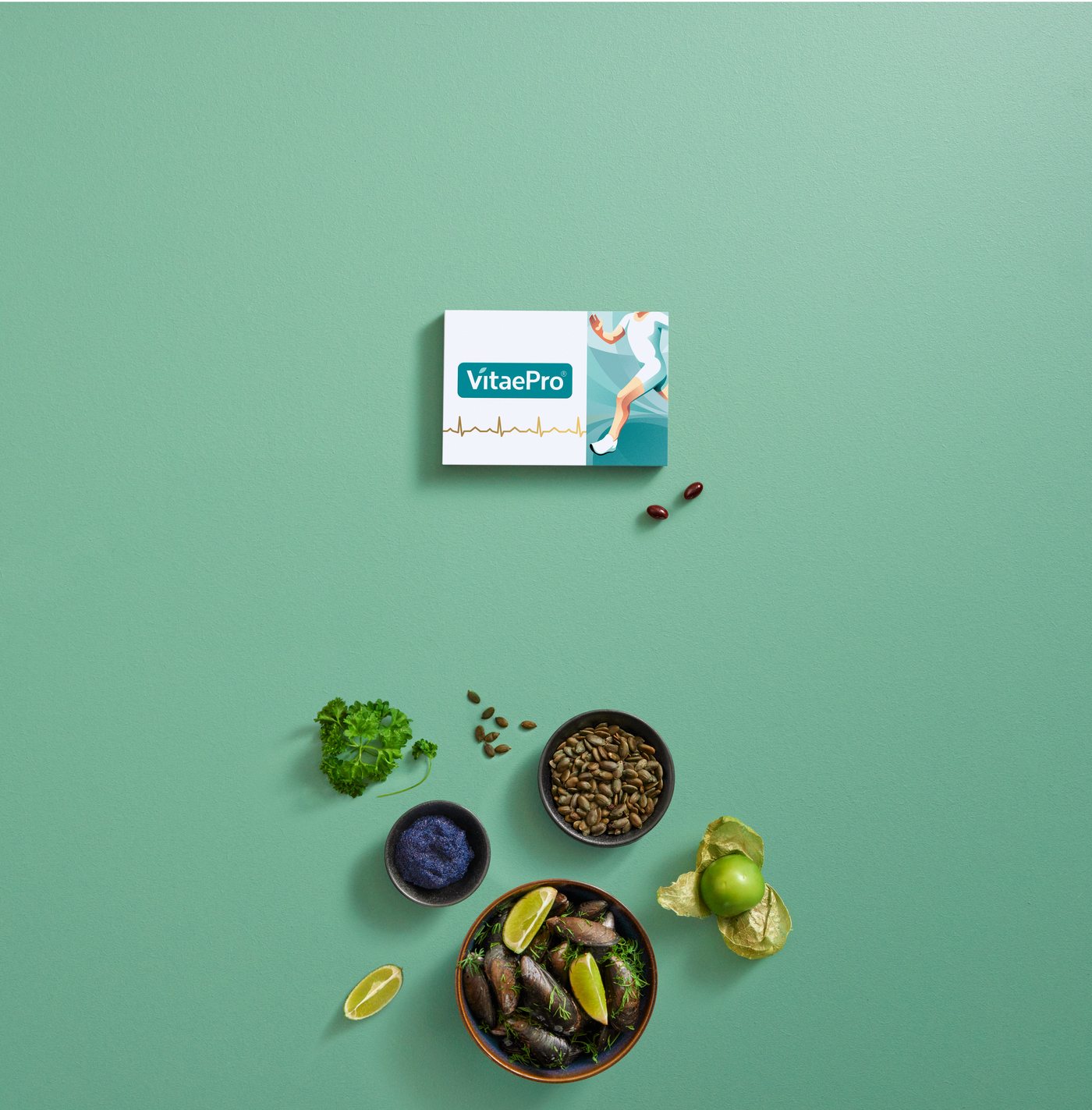
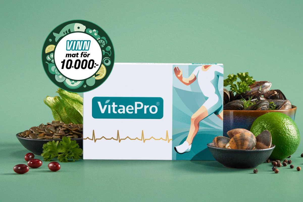
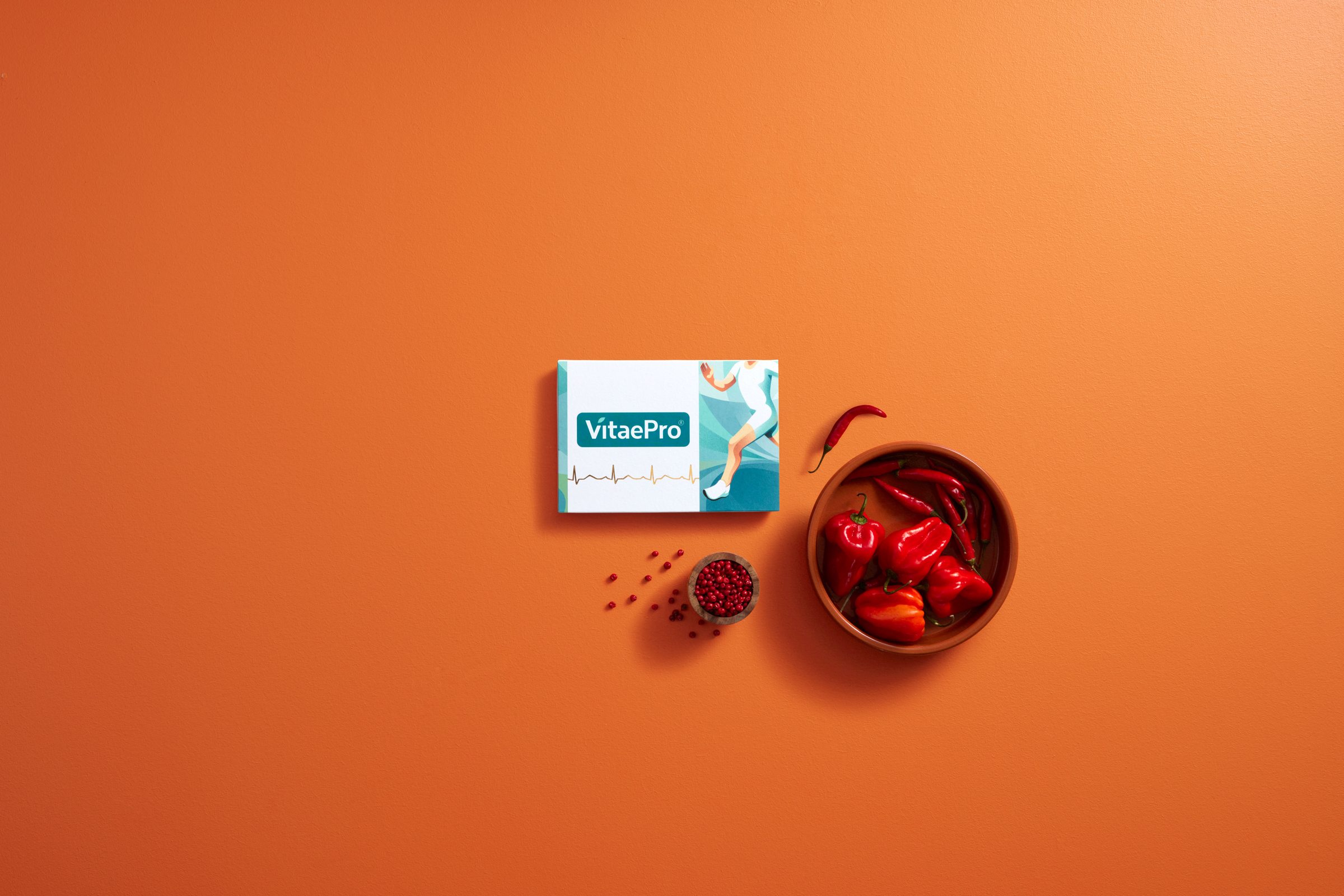
The master visuals were built in Photoshop by compositing the product into custom environments, with hand-painted shadows and light paths so every piece sits in the same light.
Each master was set up for digital banners first, balancing a premium look with offers and CTAs that convert, then scaled into print and editorial layouts. One image, the same in every channel.
03Seasons
A palette that moves with the seasons.
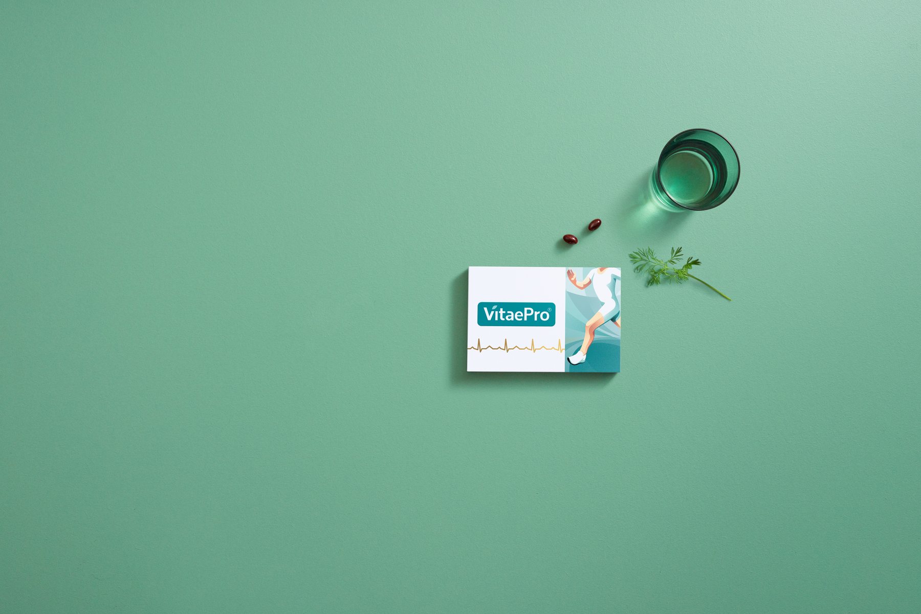
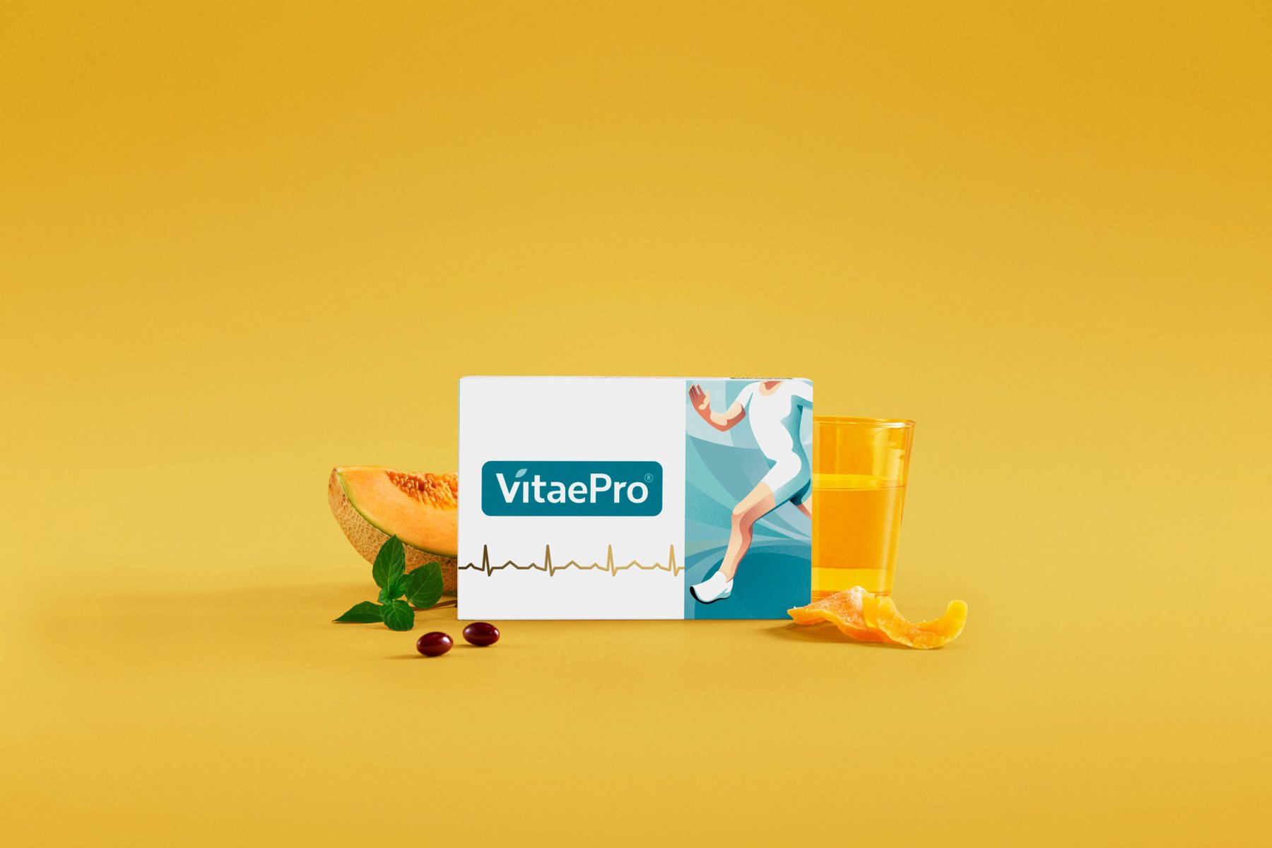
Every major campaign was shaped by the designers from all markets working together. Out of that came modular colour palettes and asset sets that change with the seasons: mint greens for spring, ginger yellows for autumn.
Background colours and offers were A/B tested to find the combinations that converted best. The winners were then rolled out across digital and print, with localised copy and CTAs swapped in for each market.
Seasonal system
- HEX
- #007D8F
- RGB
- 0 125 143
- HEX
- #6BA38A
- RGB
- 107 163 138
- HEX
- #E6BF48
- RGB
- 230 191 72
- HEX
- #C8372F
- RGB
- 200 55 47
- HEX
- #FFFFFF
- RGB
- 255 255 255
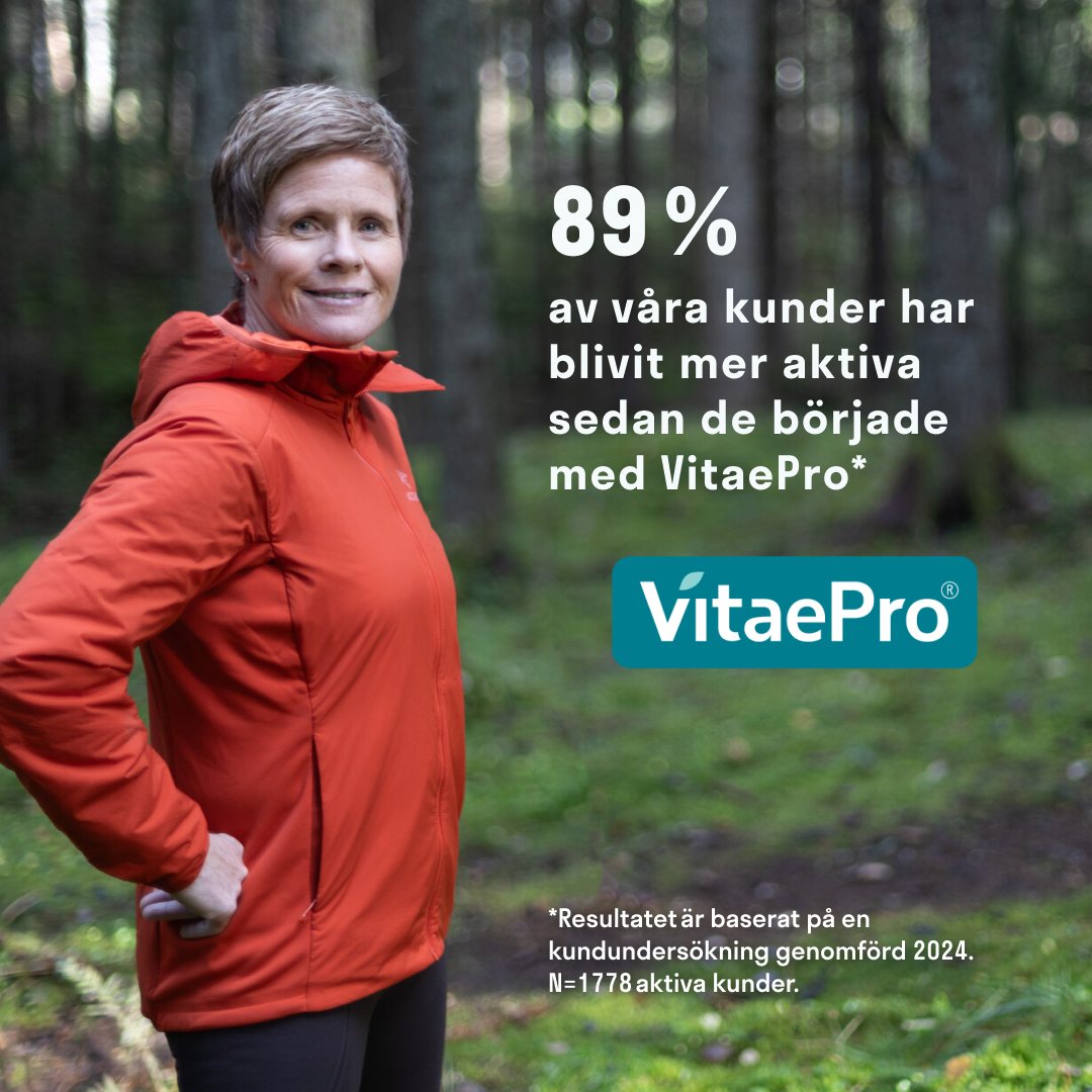
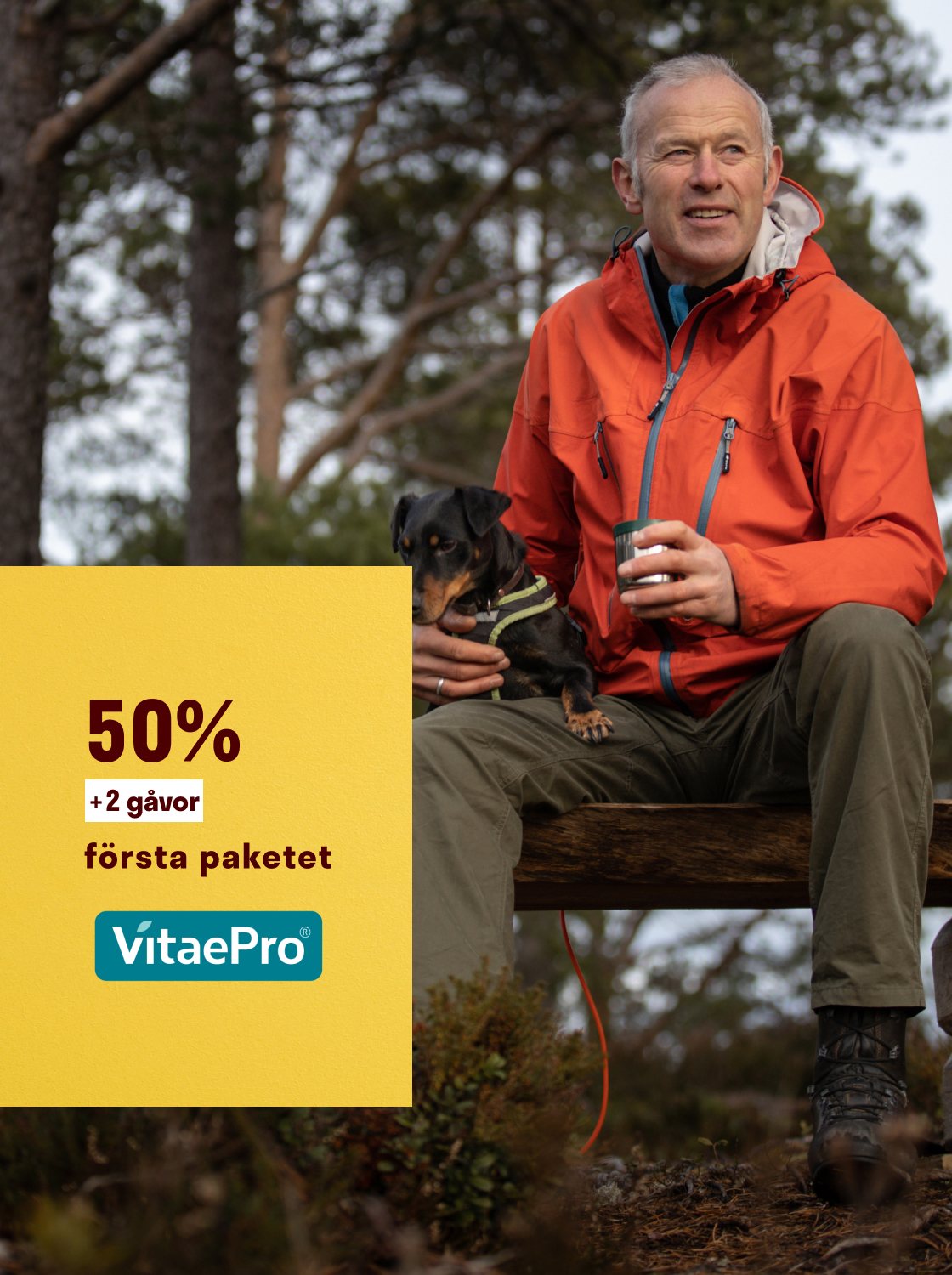
Autumn relaunch, every size
Shown at true relative scale
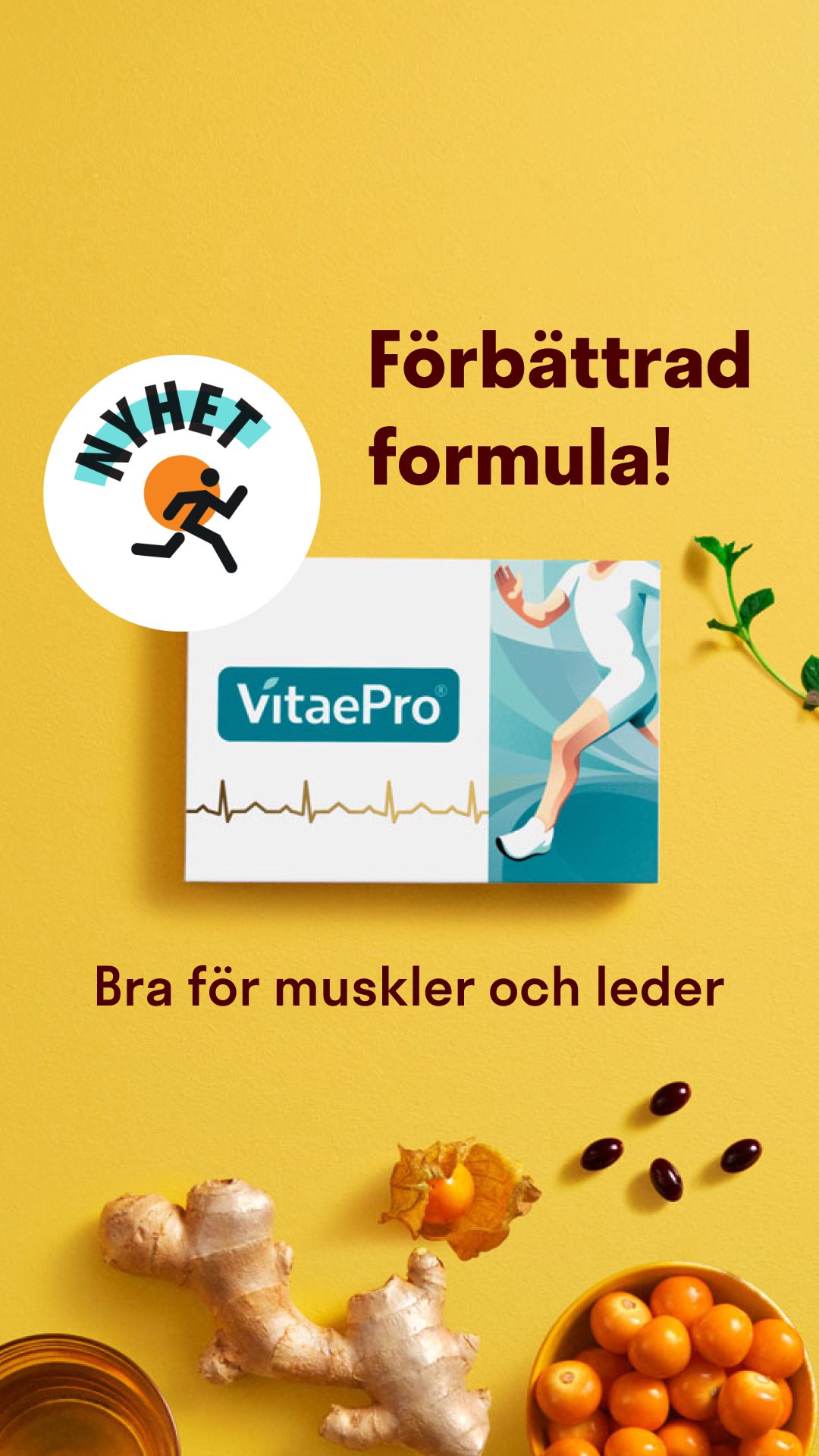 1080 × 1920 · Story
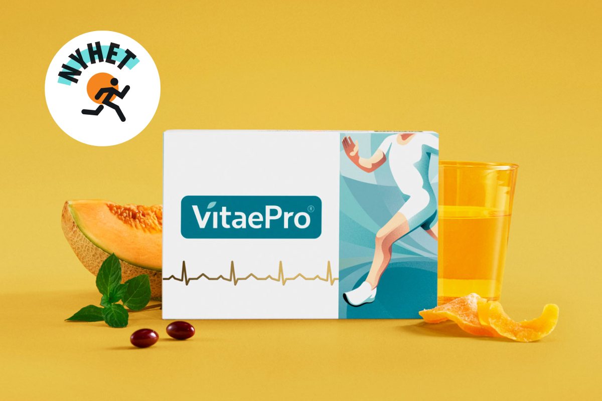 1200 × 800 · Hero
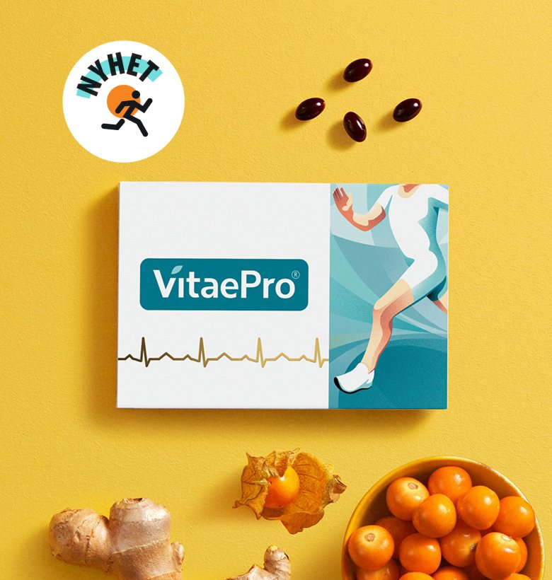 780 × 820
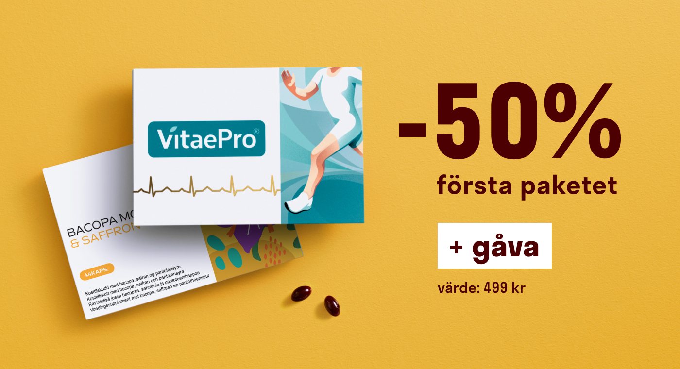 1400 × 760 · Offer
 728 × 90
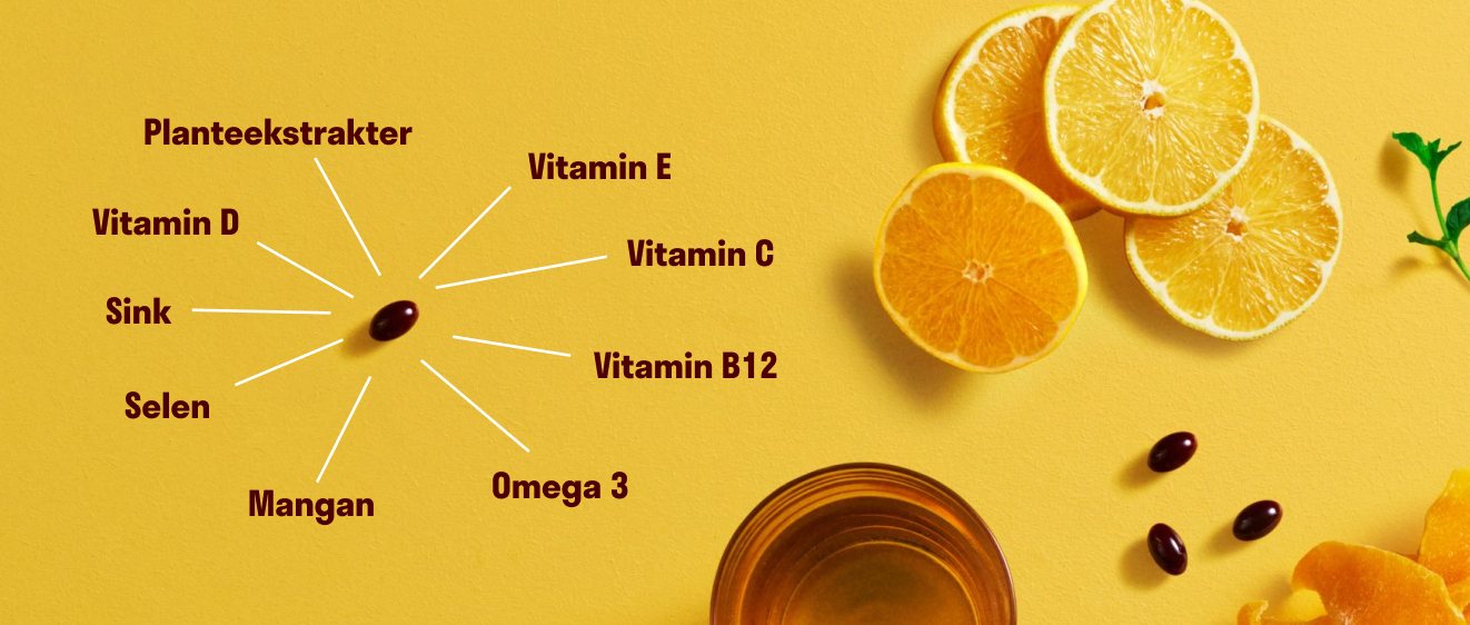 1322 × 562 · Article
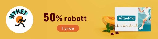 512 × 128
04Packaging
A pack that looks like today.
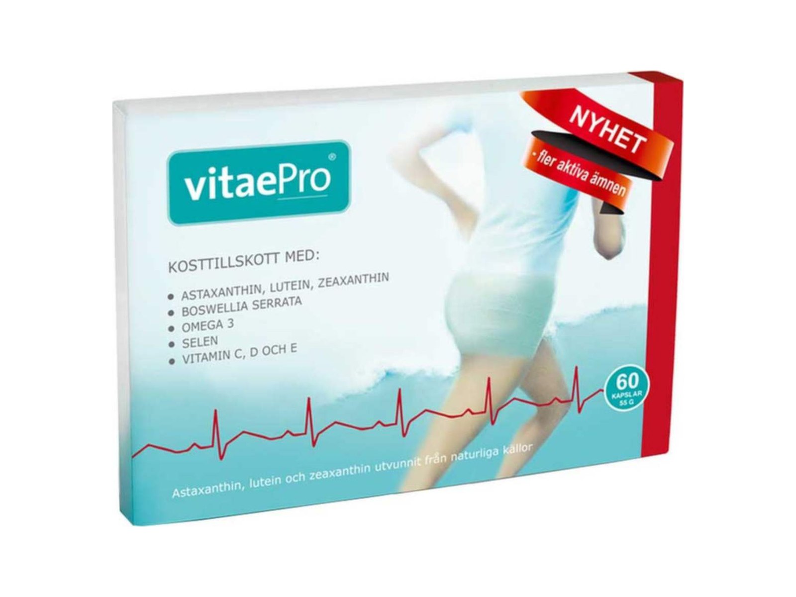
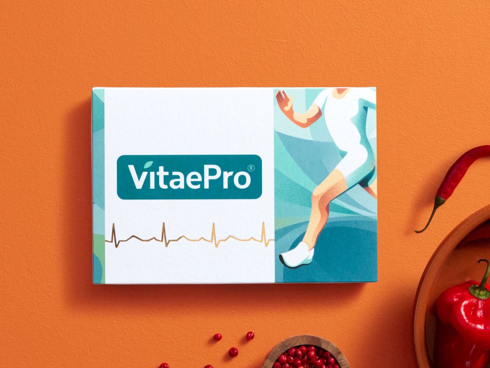
The product identity needed the same work as the campaigns. The old packs were busy: stock photography, ingredient lists on the front, sale stickers printed in.
We modernised them into a calmer, more premium system: a white front, a clear logo, one illustration per product and the heartbeat line carried over from the original.
Drag to compare: old pack vs new
05Range
One family, many products.
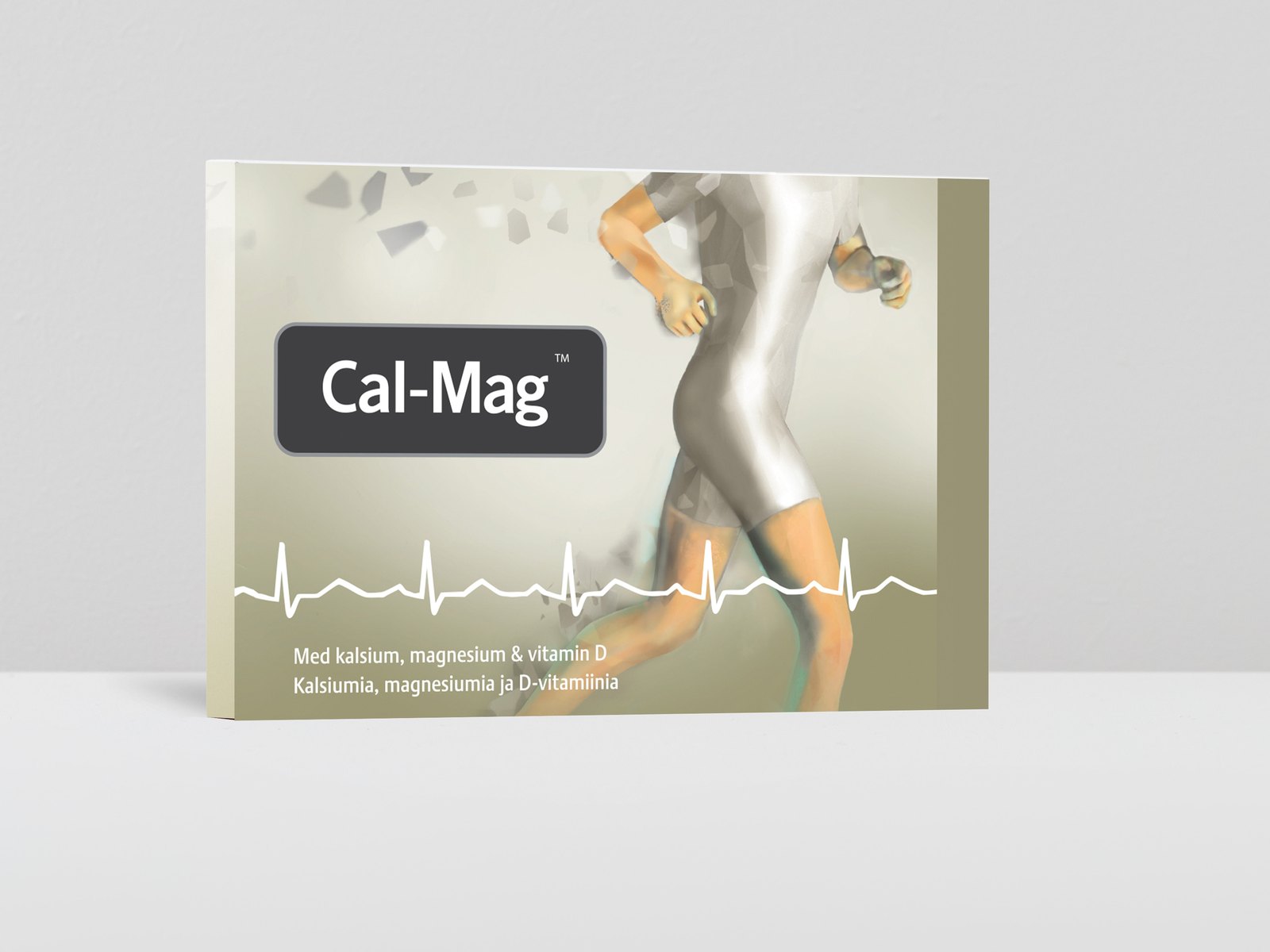
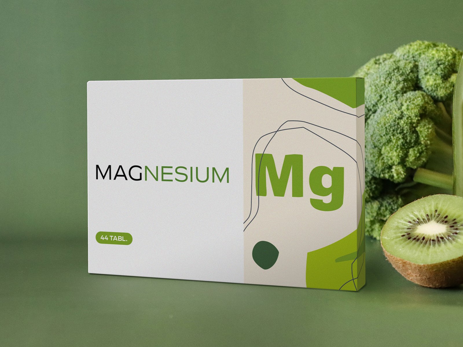
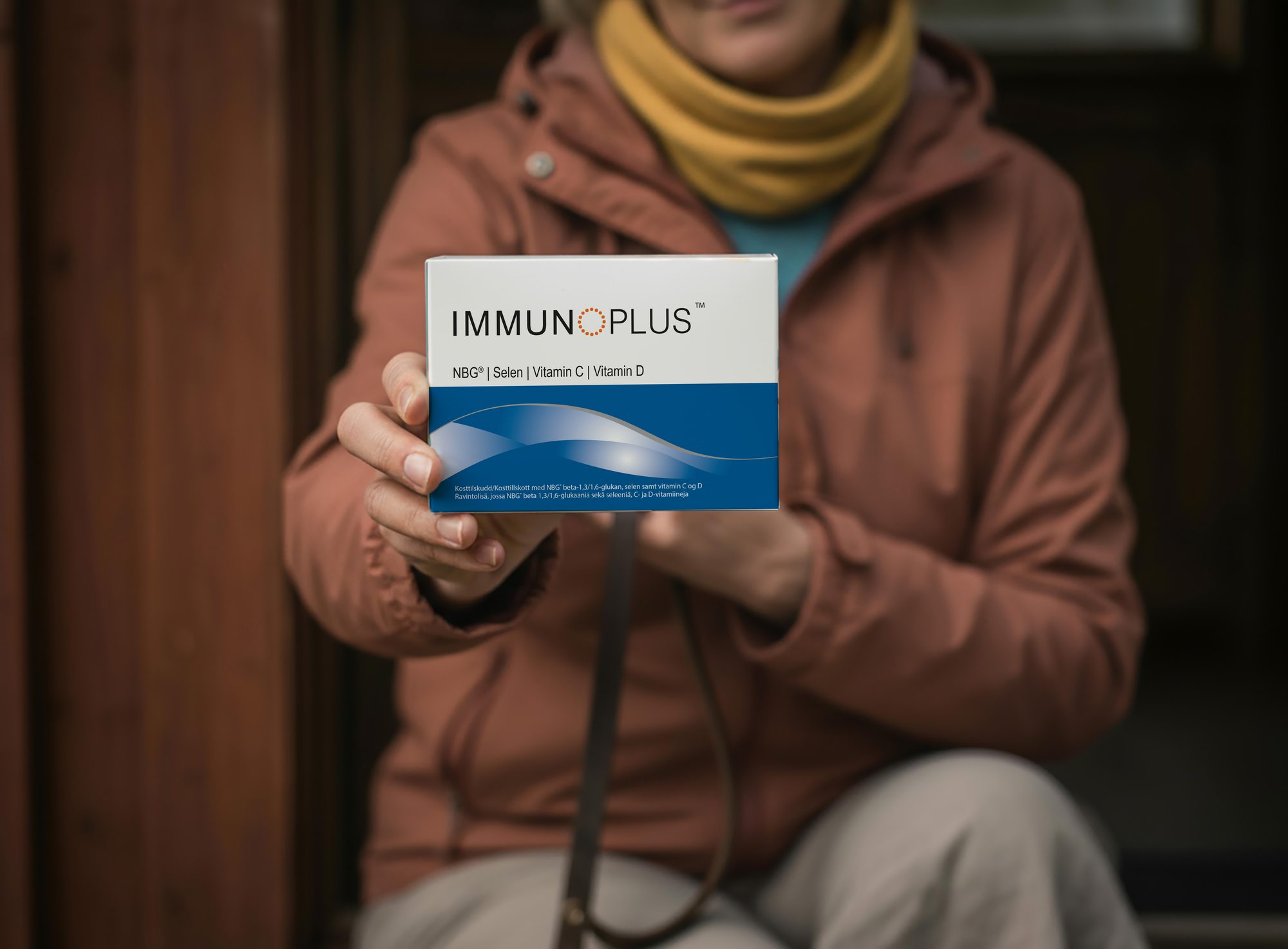
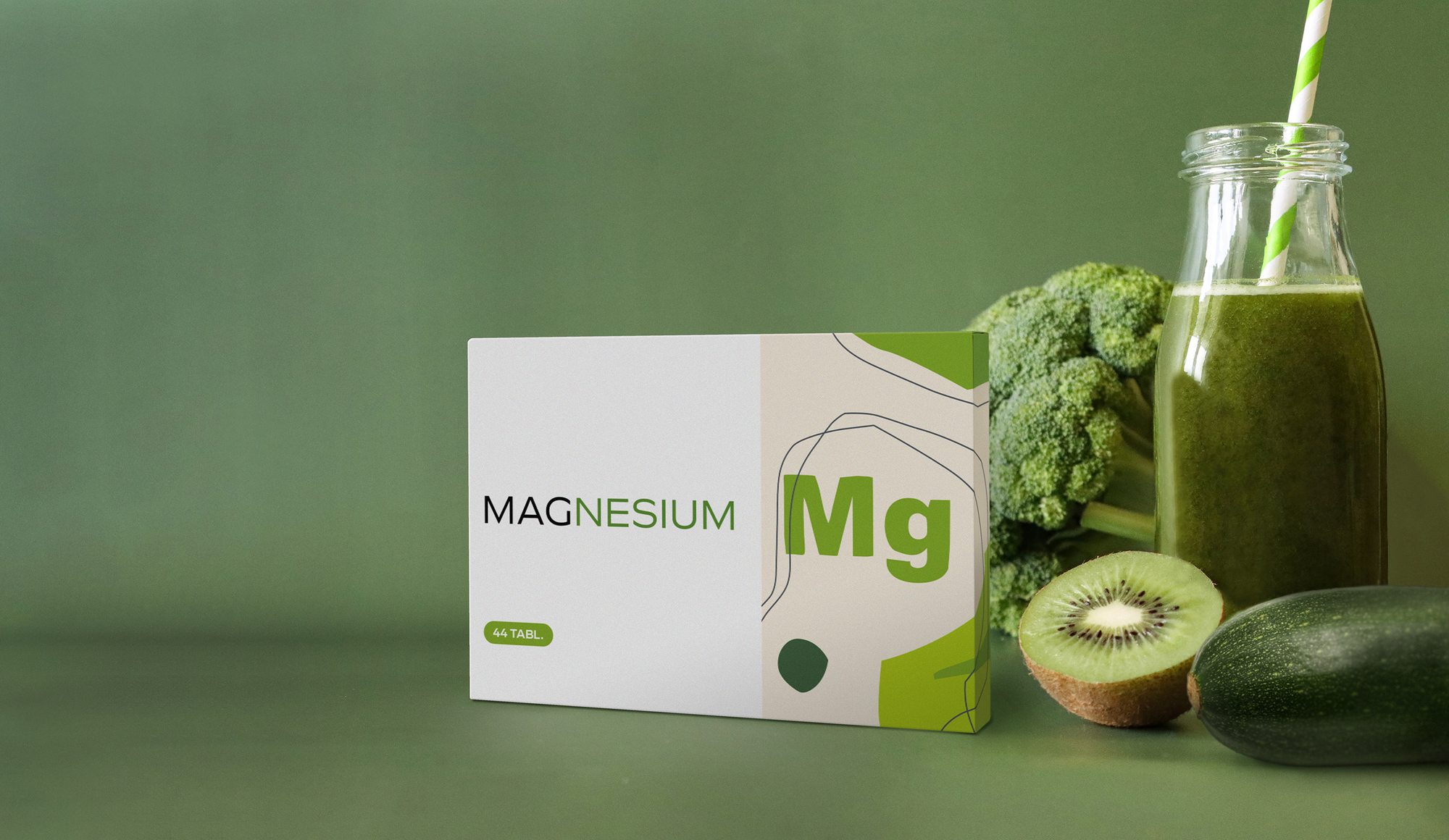
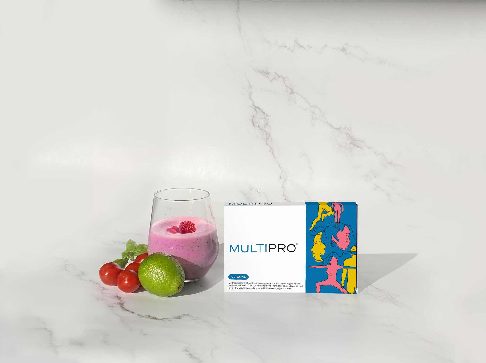
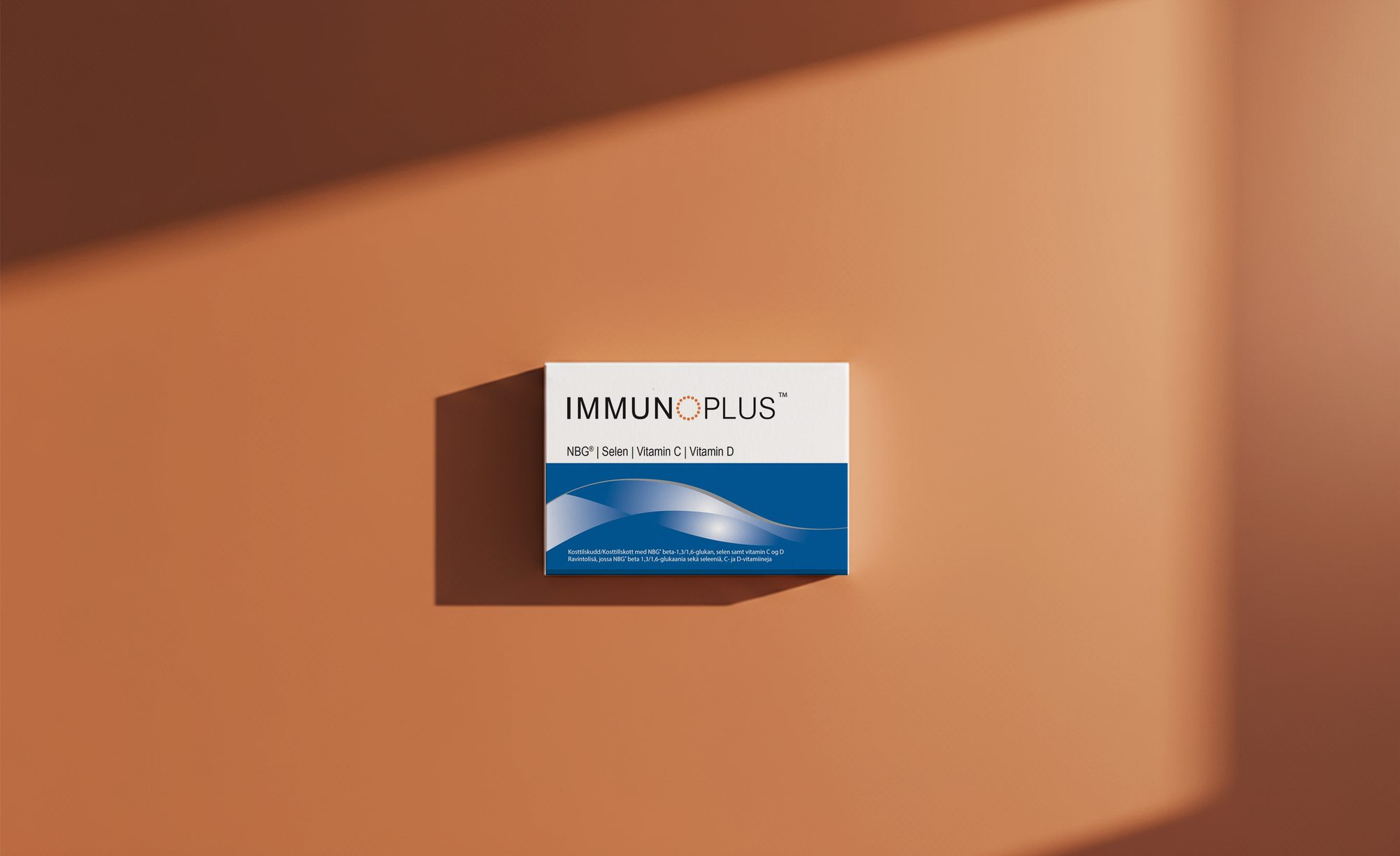
Over the years the range grew well beyond VitaePro, with supplements such as Magnesium, MultiPro and ImmunoPlus. Every launch and redesign was built on the same system, each product with its own colour and illustration on the same white pack, so the family reads as one brand on a shelf or in a feed.
06Imagery
Real people, active lives.
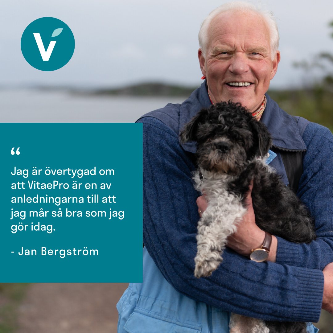
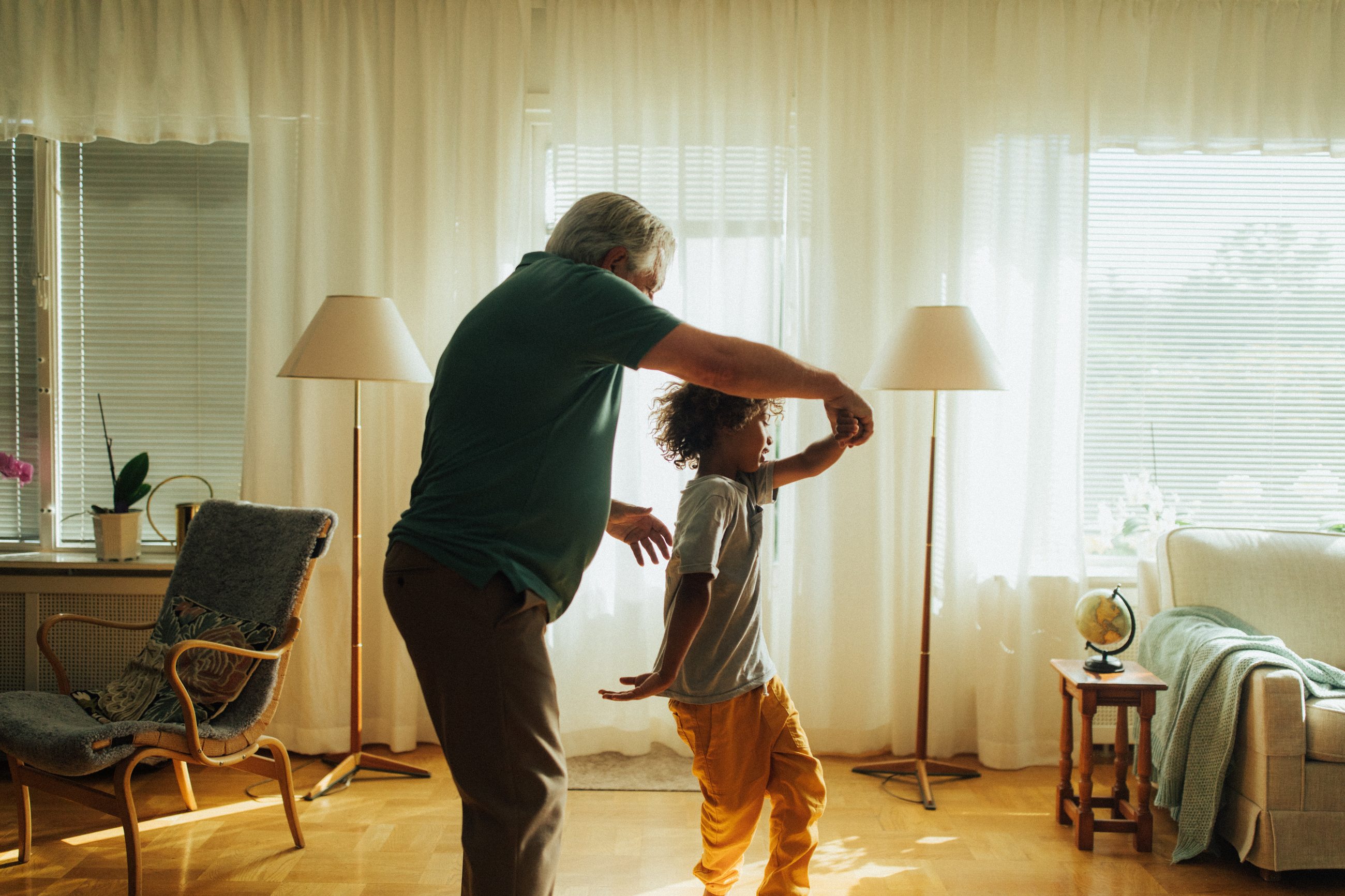
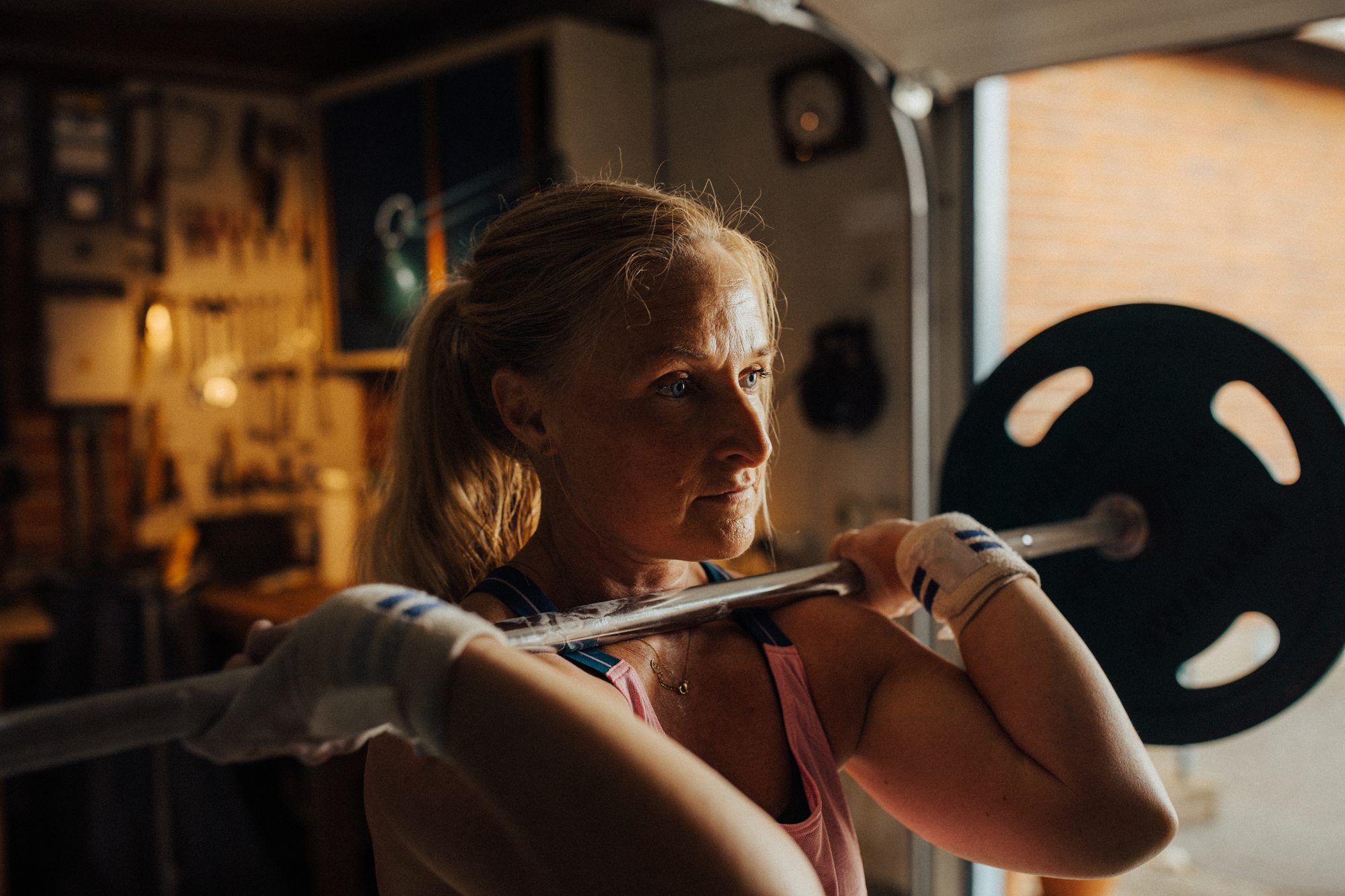
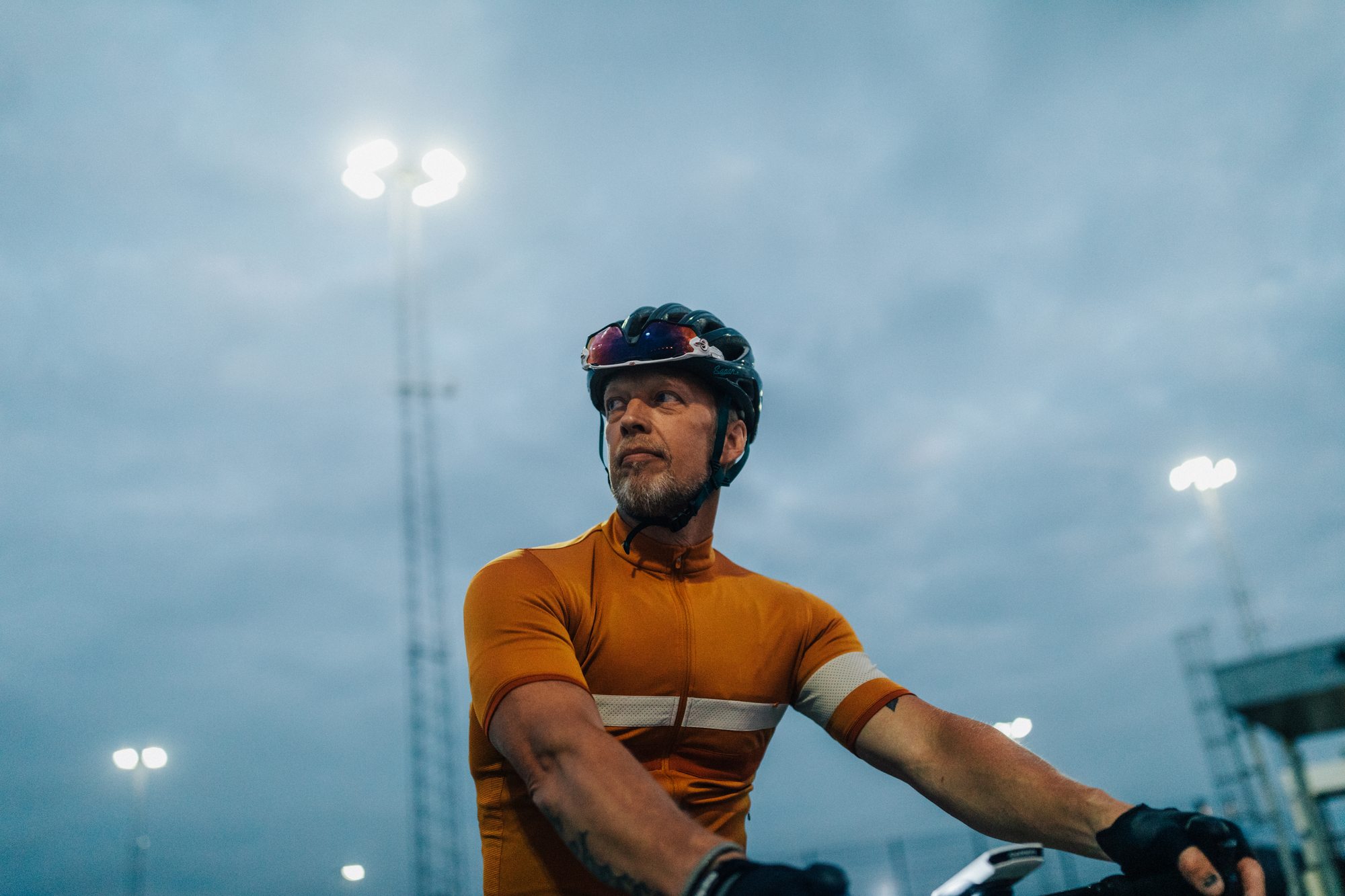
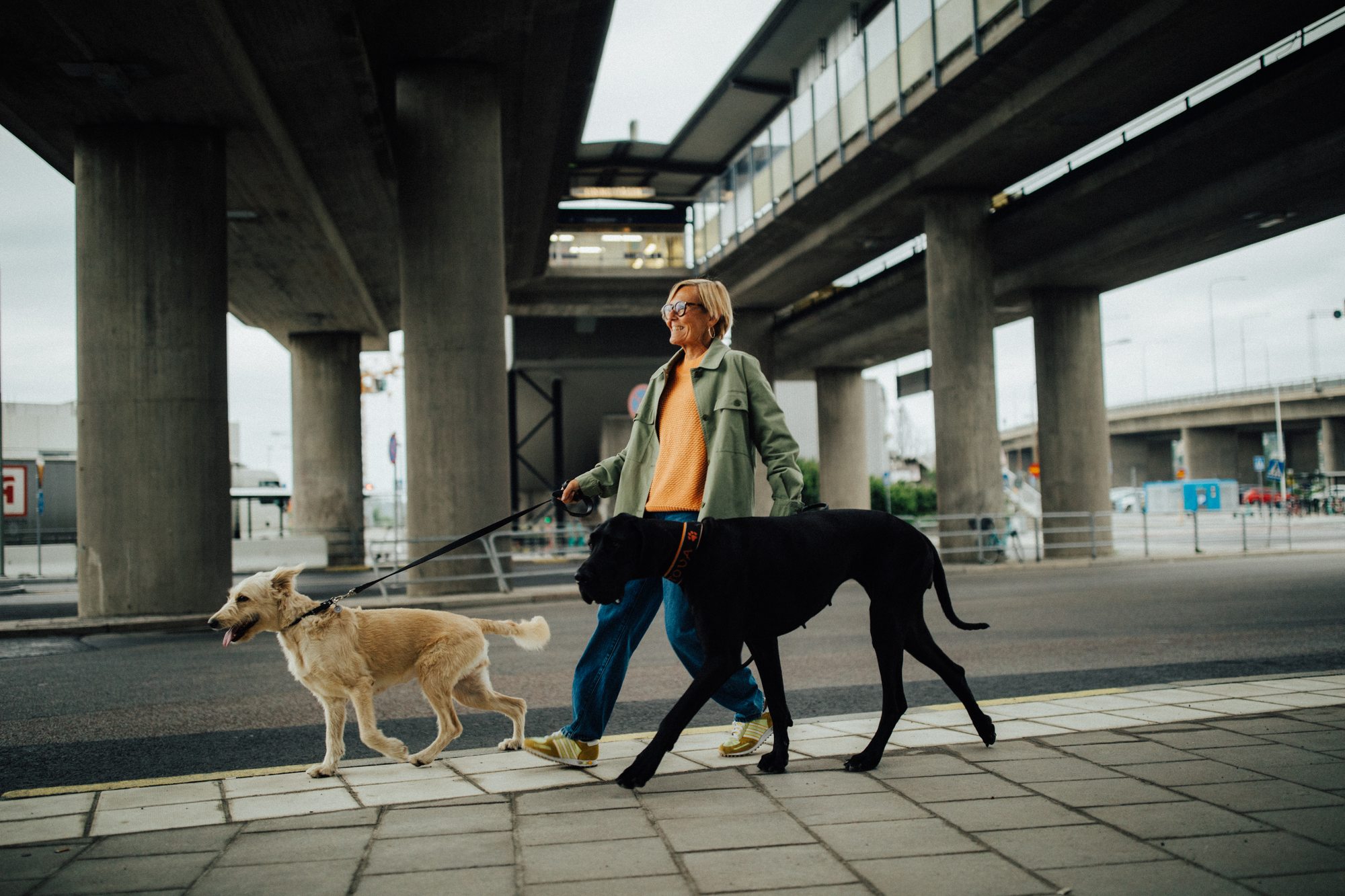
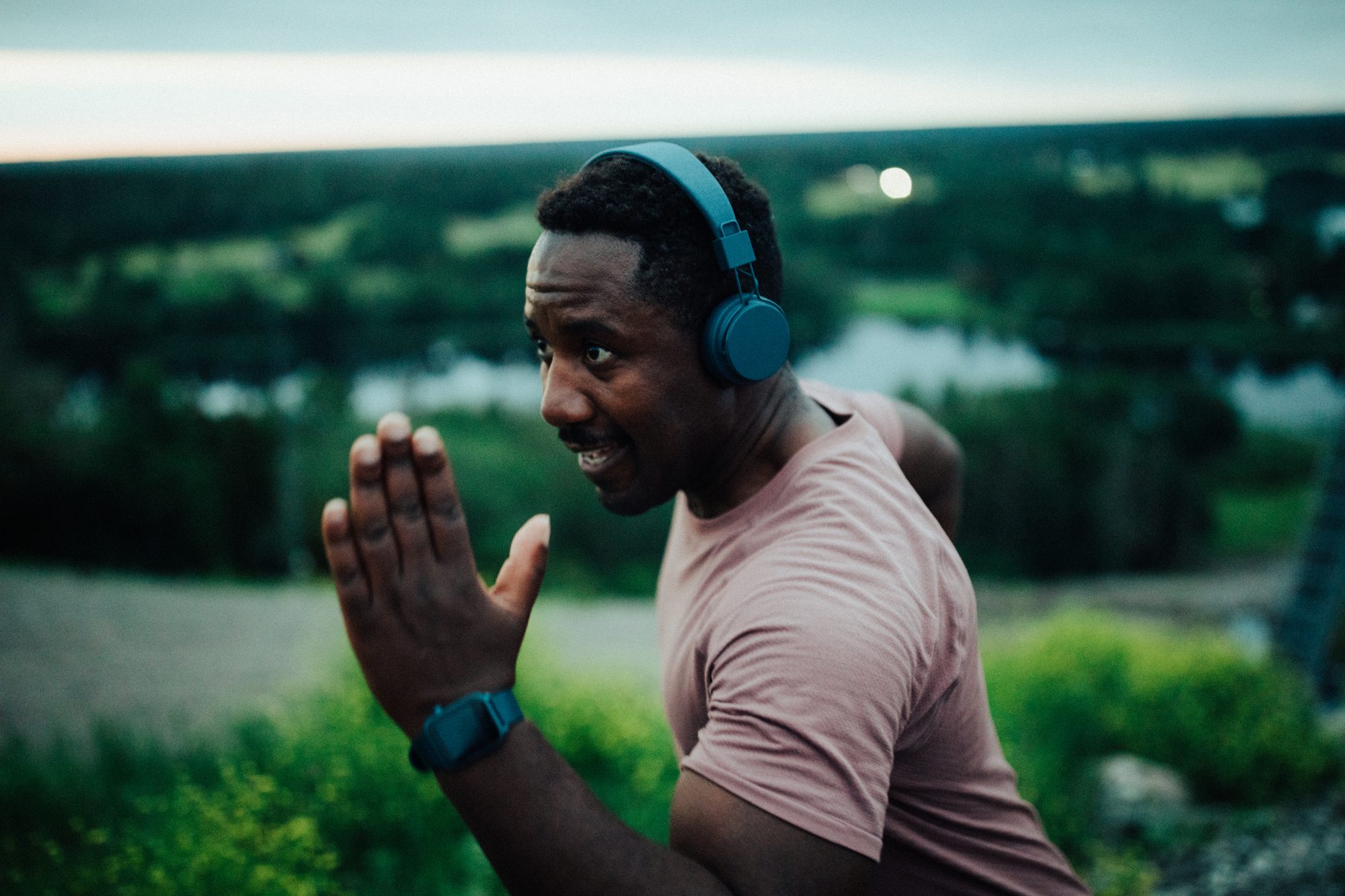
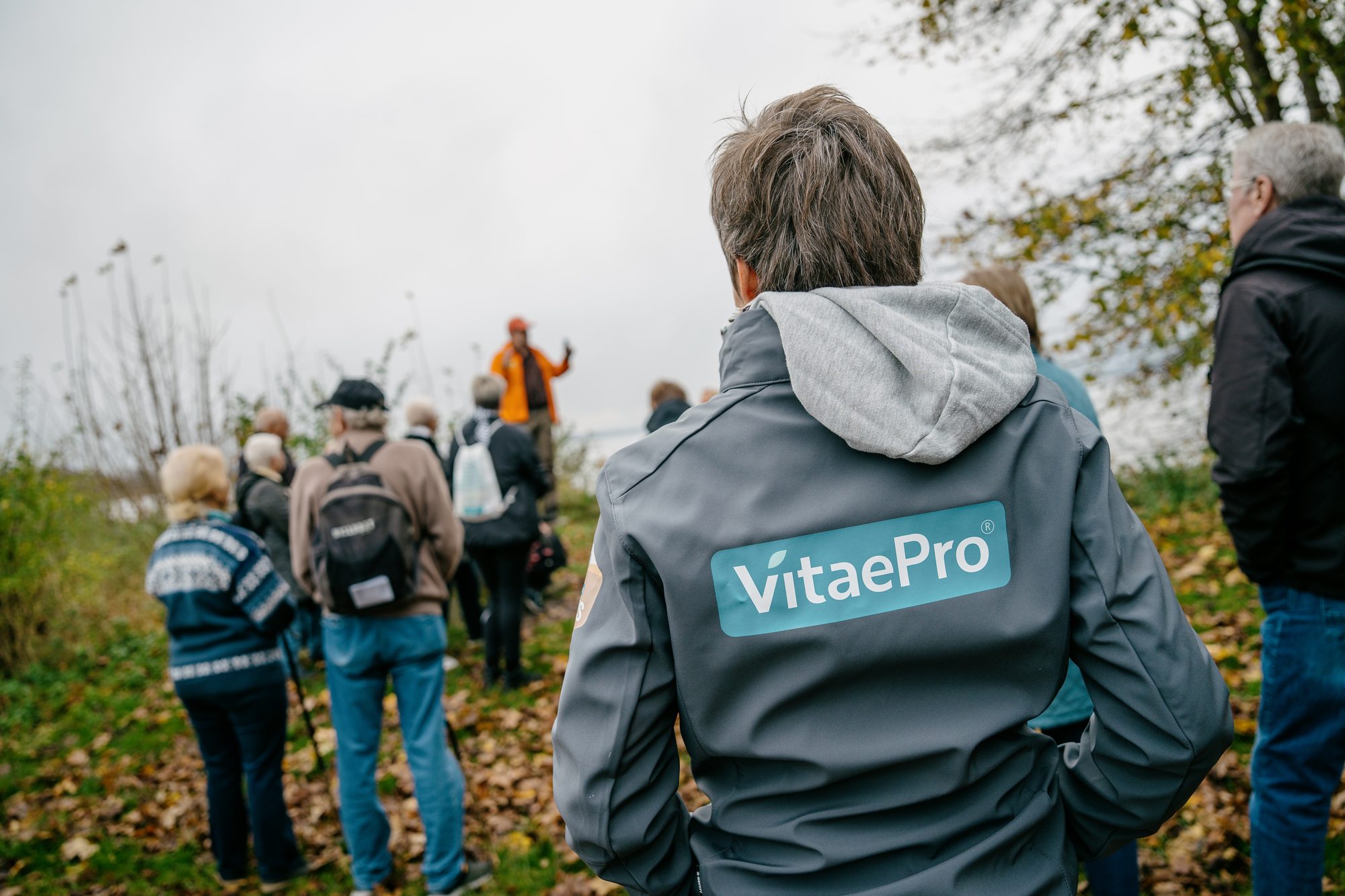
The brand photography centres on real people staying active at every age: dancing with the grandkids, lifting, cycling, out with the dogs. One consistent look and light, so the same images work in every market.
The same idea carried into social, with educational carousels built on the brand system, and into real life with VitaePro Walks.
Instagram carousel
Educational content in the brand system: eye and hand coordination, one idea per slide. Swipe, drag or use the arrows.
 vitaepro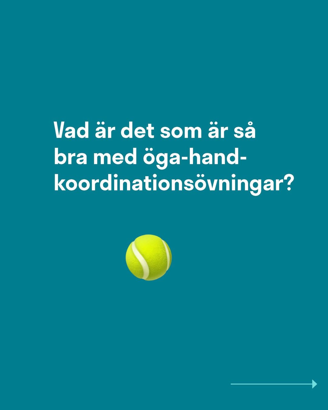
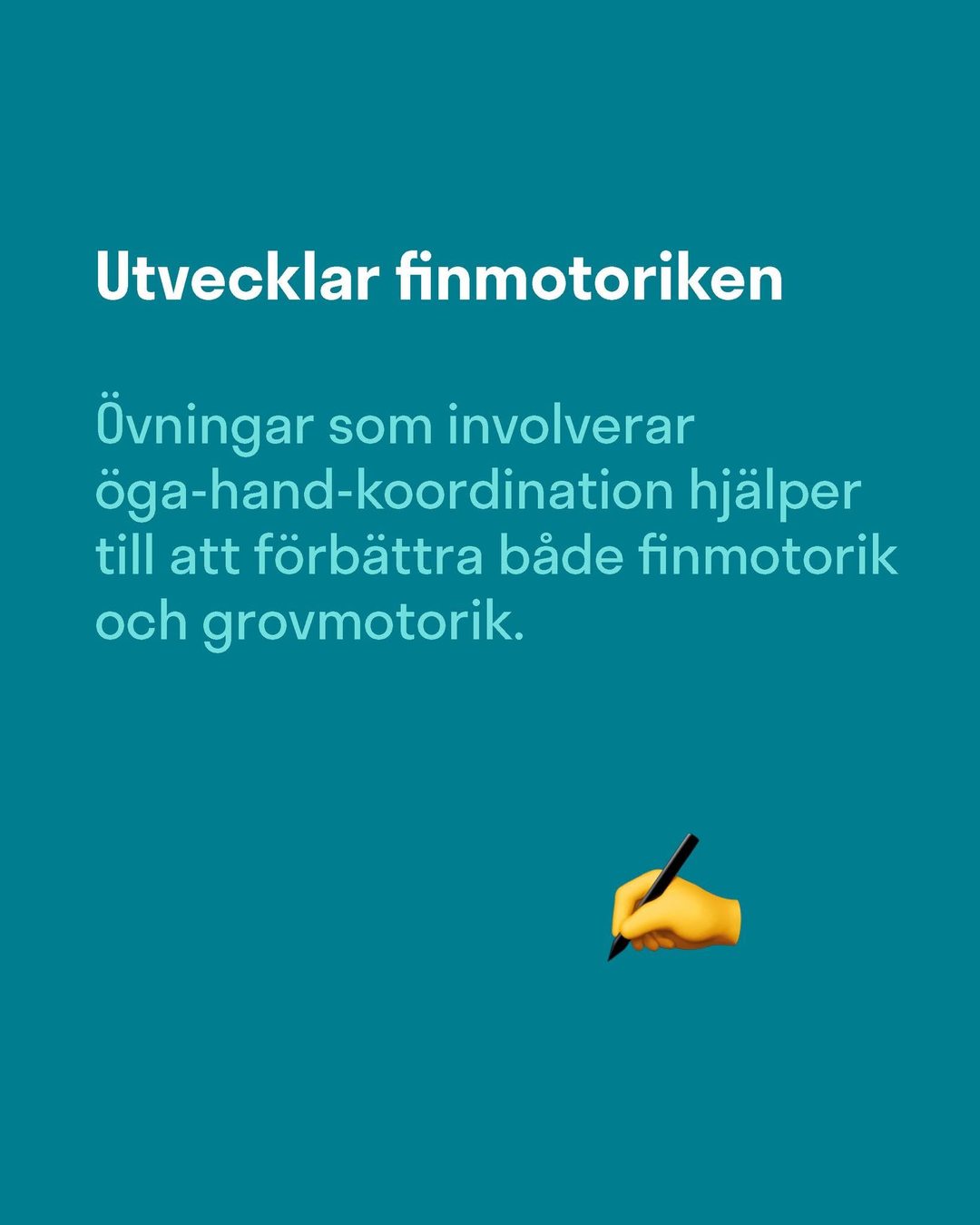
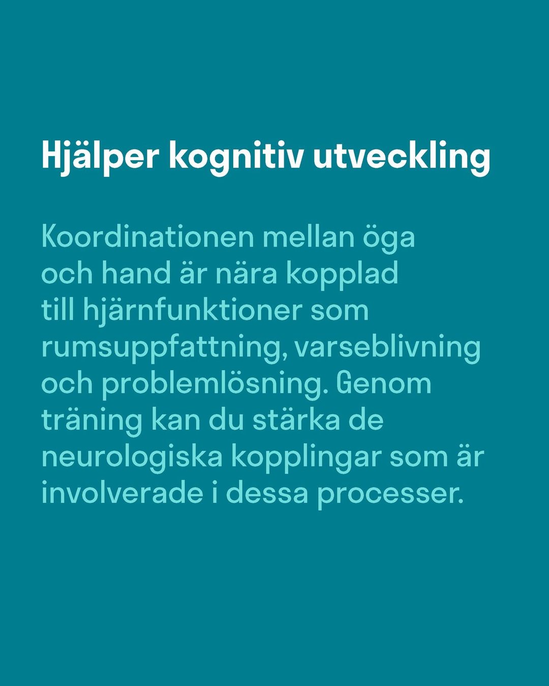
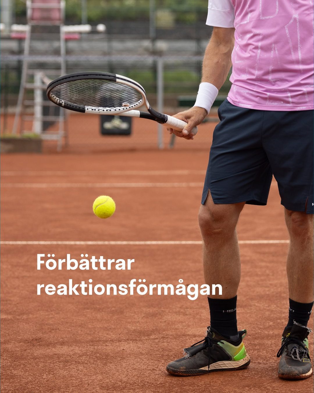
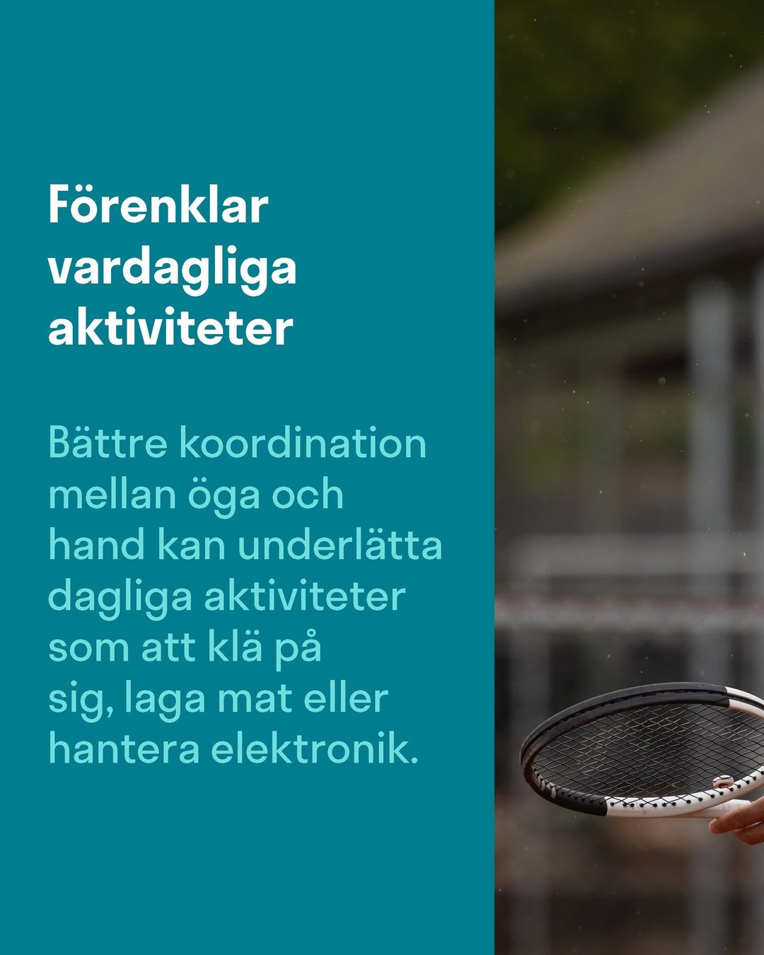
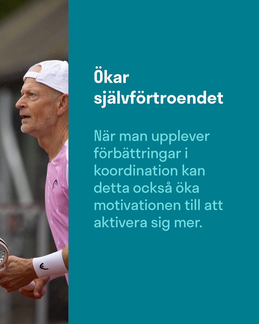
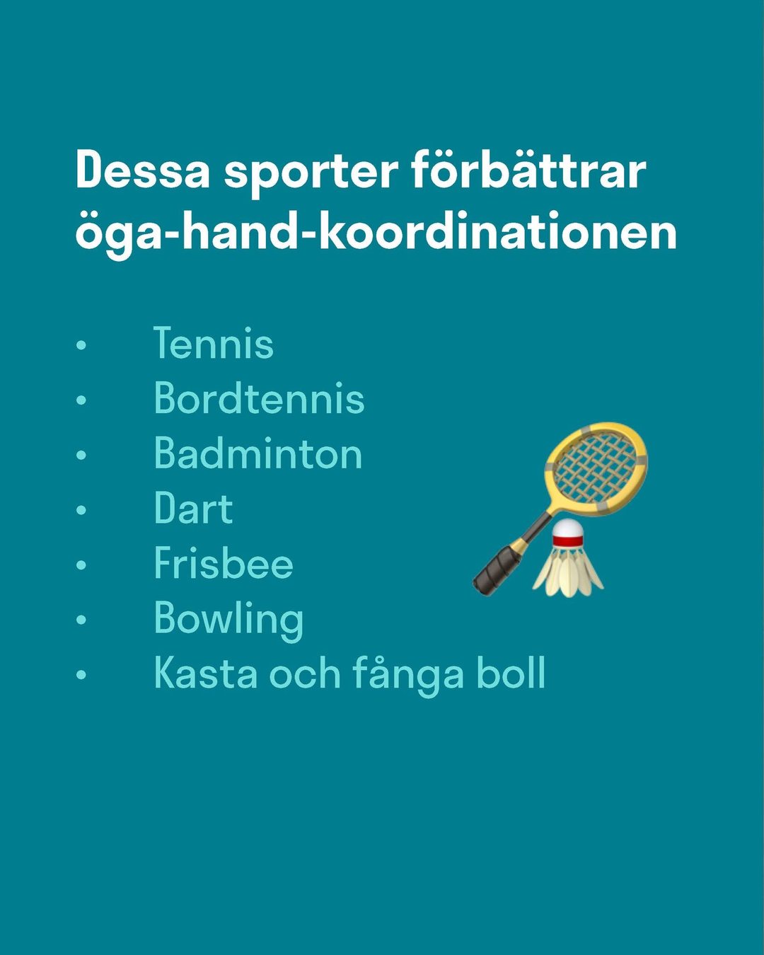
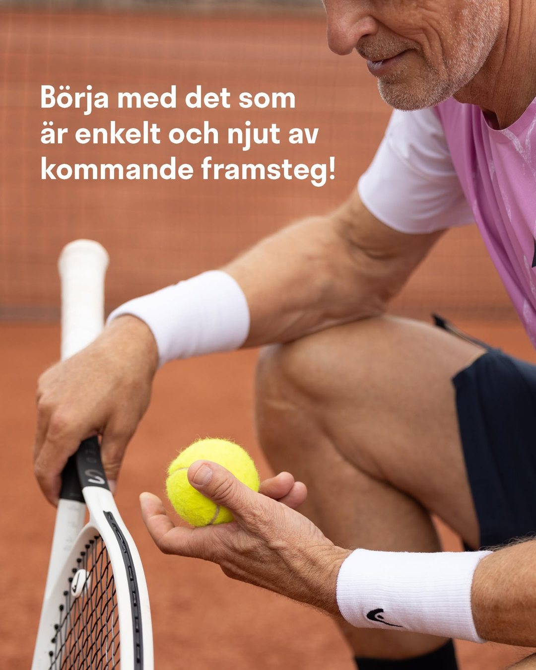
vitaepro Vad är det som är så bra med öga-hand-koordinationsövningar? 🎾 Svep för att läsa mer.
07Film
One film, native in every market.
The older films were built like infomercials: a studio interview, a phone number on screen and a list of product claims. The new ones open with a small, human story and let the product land at the end.
They were built as one universal creative that works across five countries with the same look and feel.
Professional dubbing, and later AI voice technology, made one high-end master feel local in every market. One production, many versions, and far more out of every krona spent.
Then and now: a 2018 spot next to the new concept in two markets
Turn the sound on to hear each version.
08Print & out of home
From the feed to the platform.
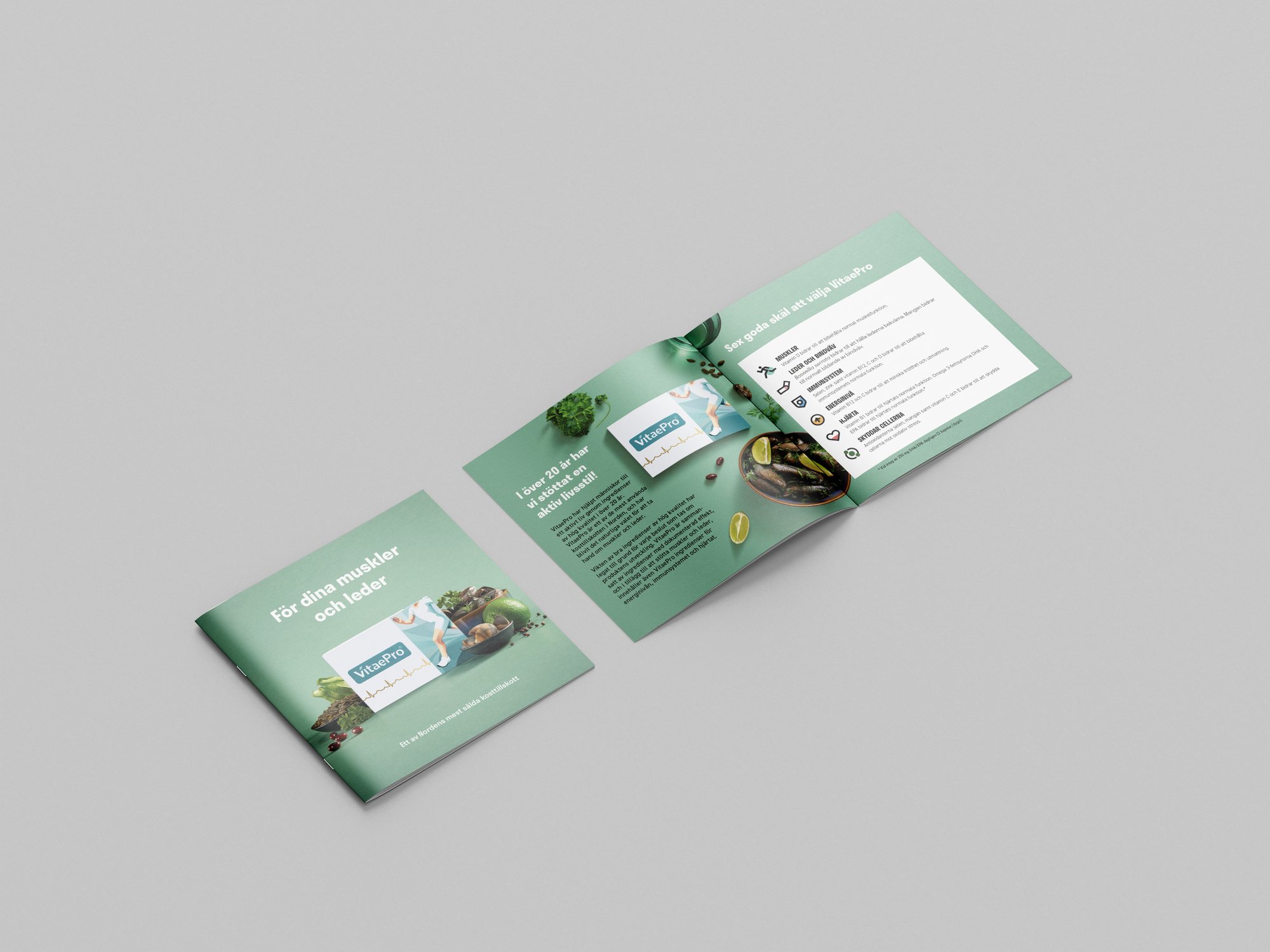
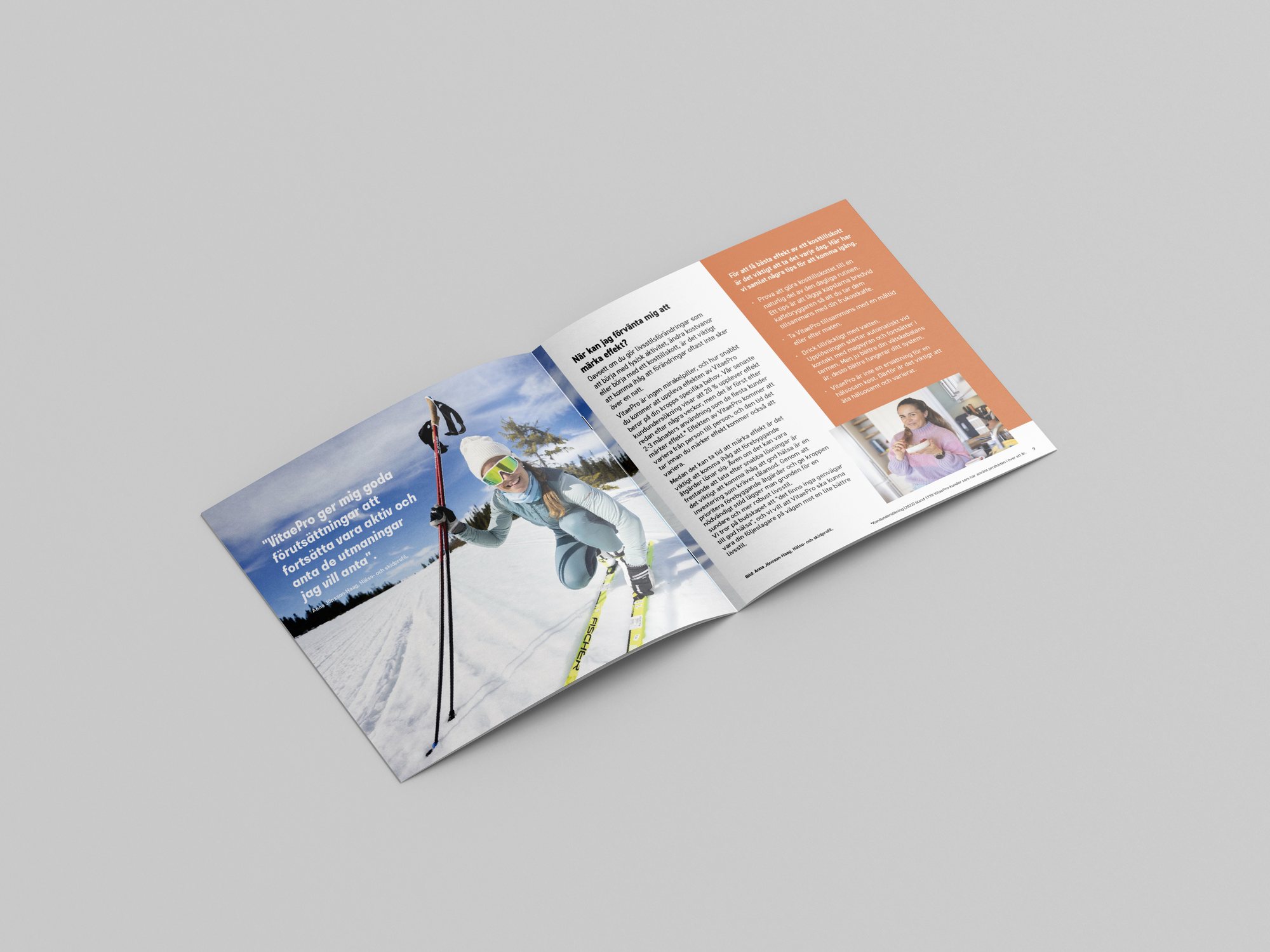
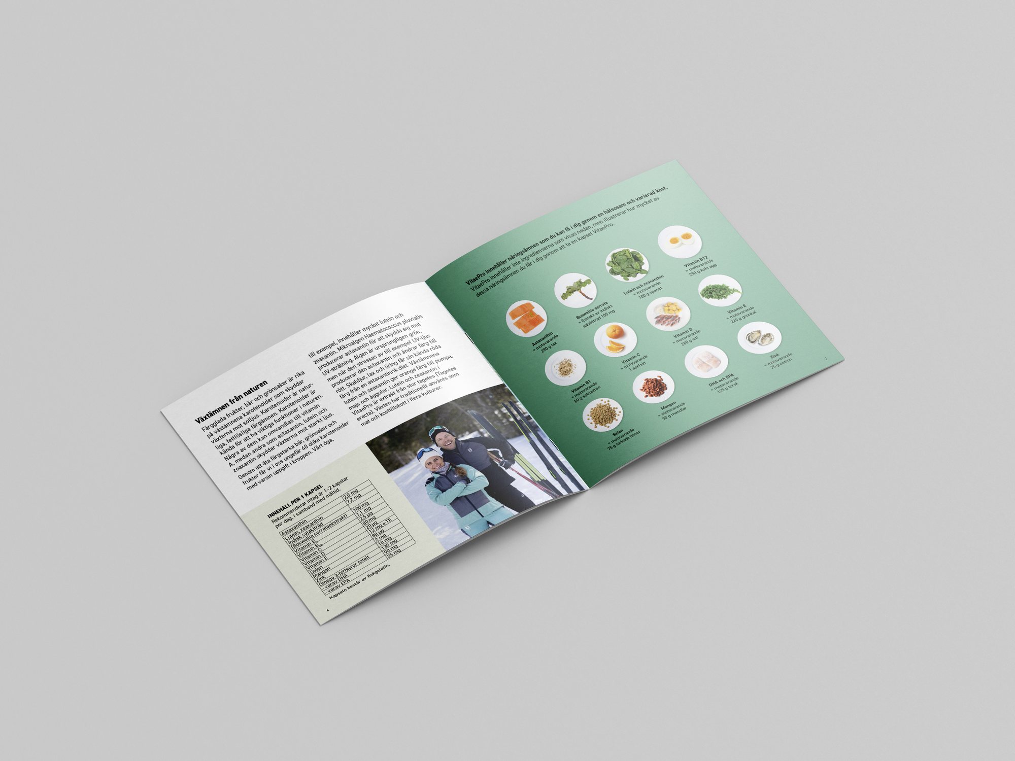
The same system carried into print and out of home: brochures that explain the ingredients and what they do, and digital screens in public spaces.

09Result
A stronger brand, growing every year.
Five markets that used to do their own thing now look and sound like one brand. Sales grew every year I was there, driven by that stronger, more unified branding, and the brand opened a new market in the Czech Republic.
The modular seasonal system and constant A/B testing gave the team a faster way to find what converts, lifted engagement and left the product with a more modern identity.